
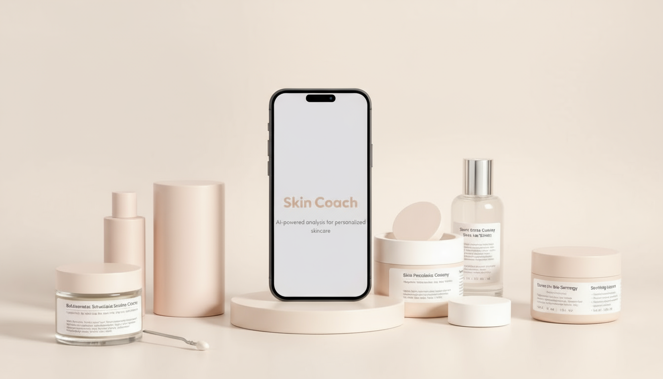
Skin Coach
AI-powered Skincare Advisor App
ROLE: Product Designer, UX design, visual direction
TOOL: Loveable, Figma, Notion
DURATION: 2 weeks
Overview
Skin Coach is an AI-powered app designed to help users understand their skin condition and build personalized skincare routines. By scanning the user’s skin, the app identifies specific issues, recommends ingredient-based product combinations, and provides safe, effective routines. This approach helps users avoid blindly layering products, prevent irritation, and achieve better skincare results.
DEFINE
Problem & User Pain Points
Skincare Becomes Complicated
Users with different skin types often apply multiple skincare products without knowing if the ingredients are compatible.

Lack of Guidance
Improper layering of products can cause irritation, allergirgic reactions, or reduce effectiveness.

Feels Overwhelming
Existing skincare information often overwhelms users with too much information or generic recommendations

Skin Coach addresses these pain points by:
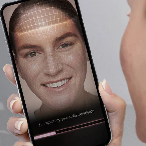
Skin photo scan
Analyzing skin condition and condition via photo scan system
Routine education
Recommending routines based on skin type and ingredient compatibility
Recommendation
Presenting recommended skincare products in a clear, concise, and visually appealing way
Design Goal
Make skin analysis simple and accessible through photo scanning.
Provide clear, personalized skincare routines based on ingredients.
Keep the app visually clean, approachable, and consistent with a nude-tone palette.
Ensure interaction is concise, intuitive, and mobile-friendly.
Include product recommendations with potential for advertising revenue.
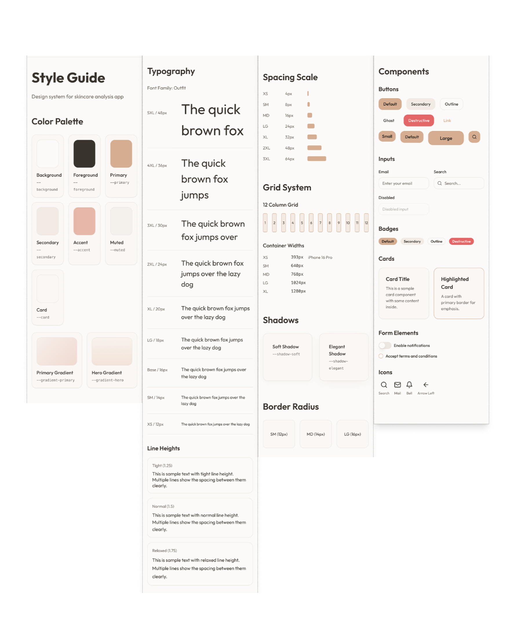
Design Process
Ideation & AI-assisted Design
I used Loveable to quickly generate initial UI concepts. By carefully crafting prompts, I guided the AI to produce a clean, nude-tone interface that emphasized clarity and usability. I then refined the outputs in Figma, adjusting layout, spacing, and typography for consistency.

The prompt I input in loveable
User Flow
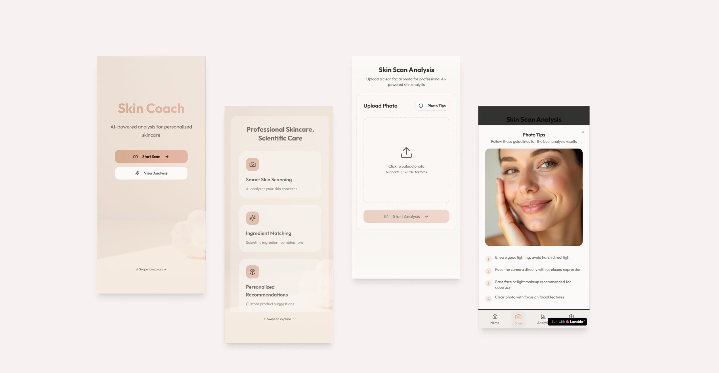
The app guides users through four main steps:
Home: Introduction to app purpose and value, presented as swipeable screens to avoid long pages.
Scan: Upload a skin photo with photo-taking tips provided as modals or swipeable slides.
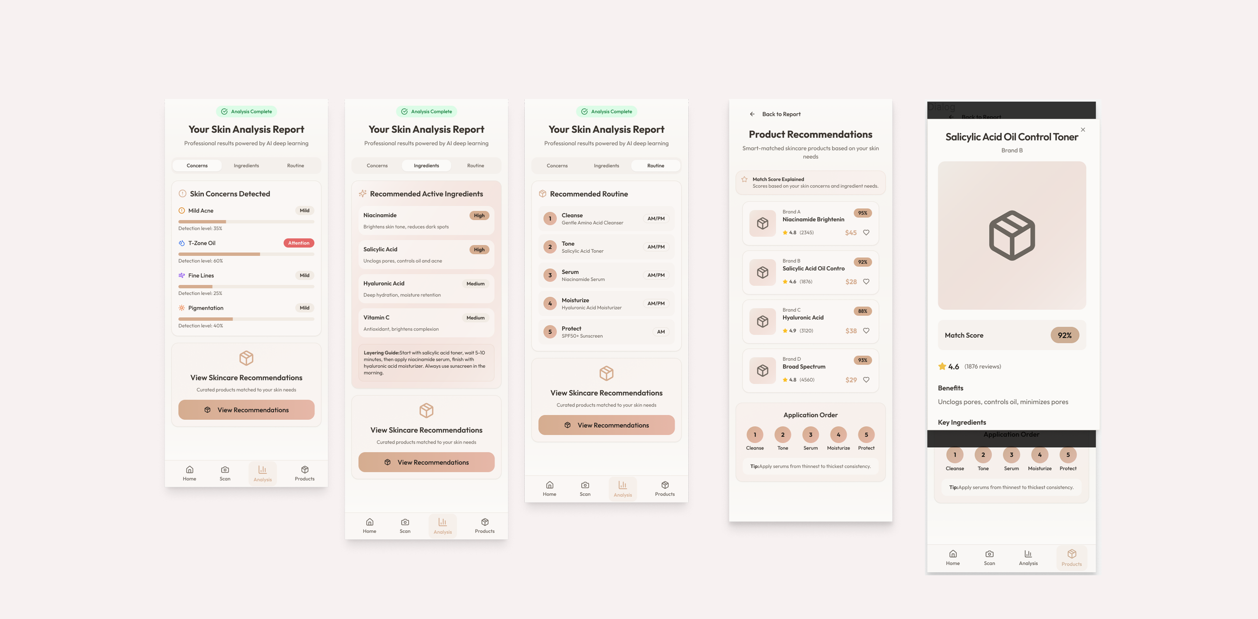
Analysis: Shows identified skin issues and provides a recommended routine. Tables are presented as horizontal scrollable content to keep pages concise.
Product Recommendations: Displays suitable products in a grid; each product can be clicked to reveal a detailed pop-up with ingredients, usage tips, and benefits.

Interaction & Visual Design
Home: Swipeable screens with brief explanation of the app and user benefits.
Scan: Photo upload interface with clear, actionable tips presented in a pop-up modal or slide carousel.
Analysis: Horizontally scrollable tables showing skin issues and recommended routines.
Product Recommendations: Product cards with click-to-expand pop-ups.
Visual Style: Nude-tone color palette, clean typography, consistent iconography, and spacing designed for mobile readability.
Final Design / Outcomes
Home: Swipeable introduction screens explaining app purpose and benefits.
Scan: Intuitive photo upload with tips for optimal capture.
Analysis: Recommended routines presented in concise, navigated selection
Product Recommendations: Grid of product cards with detailed pop-up views.
Value Delivered:
Users can follow a safe, personalized skincare routine without guesswork.
Clear visualization helps users understand ingredient combinations and avoid potential irritation.
Potential for monetization via sponsored product recommendations or advertisements.